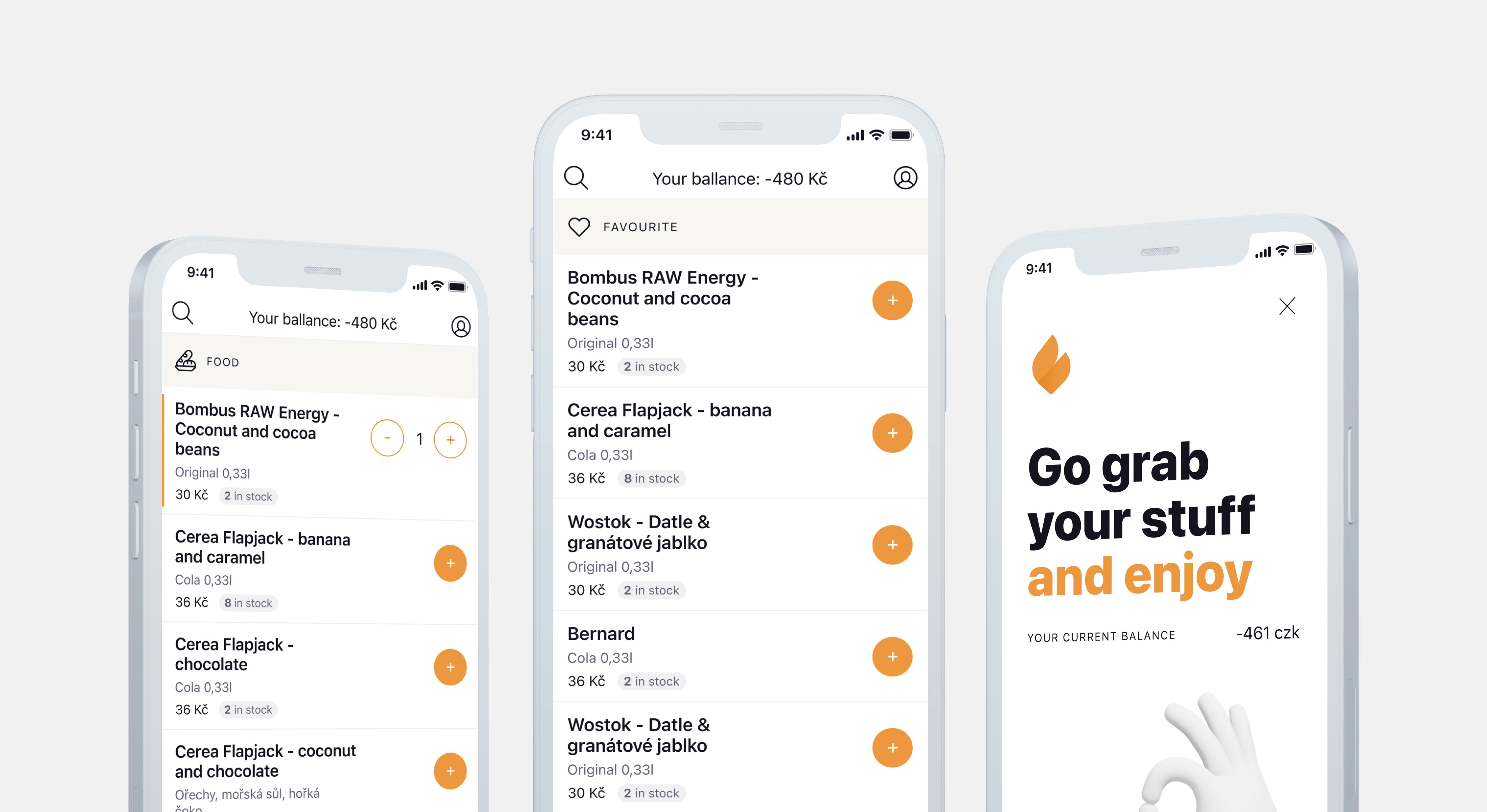
We recently celebrated an important milestone in the history of Applifting–we launched the first version of our first ever custom app. It's called GetSnack, and it helps to manage corporate or team snack bars. We shared the process of its creation through a live case study that mapped the steps and thought process from user research to validation to legal aspects. In a new series of articles, we share more details of this personally groundbreaking project. And we'll start with the “making of” of the landing page.
GetSnack was born of our internal Fridge app, where we keep track of all the snacks purchased at the office. It helps our front office colleagues with administration, billing, and stock management. During 2021, we were sharing information on social media about this nifty little piece of software, and based on the positive feedback and interest shown in a similar solution, we decided to create our first custom app for commercial use.
A bet on the fake door
The product team consisting of Martin and Roman, supplemented by our UX designer Tomáš, started implementing the steps necessary to transform our internal system for managing company snacks into a commercial app called GetSnack.
At the very beginning, we were operating with nothing but a few people who expressed their interest in an app like this, and we needed to find out what the market was saying about it. We decided to use a landing page and a technique called fake door. What is it? In a nutshell, it's about creating the illusion that your idea already exists in the form of a product, service, or app feature. But in reality, it's all just on paper, and you're trying to see if there is any market interest to begin with—that is, before you go into expensive development or production. That's usually done with a simple website that helps you measure future user response based on their actual behavior. This is exactly what we used.
Want to know more about the fake door test and its potential risks? My colleague Roman shared his experience in a separate article.
Finding the right balance
Apart from the appropriate tone of voice towards potential consumers, we were mainly concerned with how far we would let the users go within the landing page, or how much of an illusion we would create about our non-existent product. In general, the larger the illusion, the more likely people are to get angry at the moment of awakening. But on the other hand, it's also true that the further users go through the site, the stronger their interest.
The line is very thin, and we had to find a balanced and at the same time sufficiently conclusive solution. In our case, we had the prospect continue to a button with a specific quote that they had to click on—only then we got the conversion we needed. This was the moment they discovered that the app wasn't ready yet. To continue working on GetSnack, we needed to collect a few contact details as well, so we opted for an honest form of communication.
